PDFSwift
OVERVIEW
PDF Swift is your intuitive document editor that effortlessly caters to professionals handling contracts and students annotating notes, simplifying PDF editing for all.
Three Major Use case of the app:
Scan a document
Edit a PDF
Share PDF with others
.png)
To define the information architecture of the app, we asked these questions:
1. What are the primary reasons people edit documents?
2. Are there any specific industry or users who require specific tools?
3. What essential & advanced features should the app include?
4. Should the app be compatible with various formats beyond PDF such as PNG, JPEG, DOCx etc?
5. Is there a need for web-based or cloud integration for seamless access across devices?
DESIGN PROCESS FOLLOWED: Agile UX
ROLES AND RESPONSIBILITIES
I led the design from 0-1 along with another designer, from researching, and identifying gaps, to designing & finally handing off for implementation.
THE MVP
-
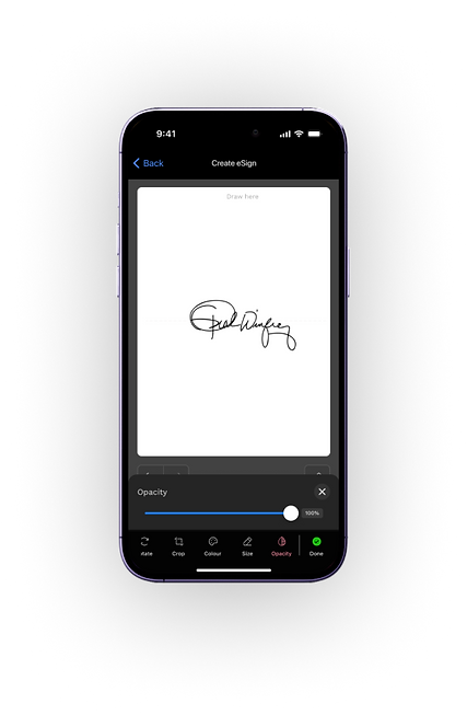
Define the basic editing functionalities of a PDF doc such as text editing, eSigns, annotations etc
-
Minimalistic intuitive user interface
-
Addressing basic document security concerns
-
Feedback Mechanism: Conducting internal testing, gathering feedback & iterating based on feedback.
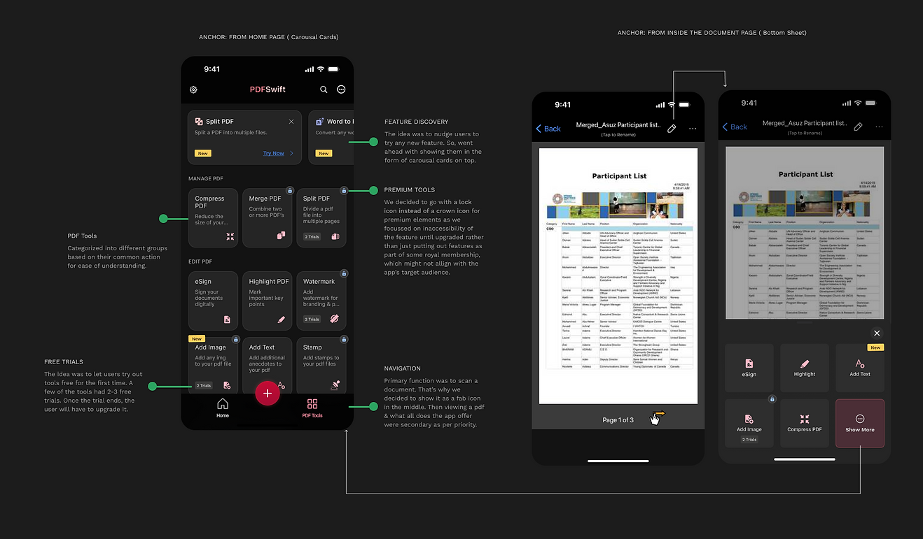
Prioritising features, architecting flows & navigation
.png)
Feature Prioritization: In order to prioritize what feature would create the most value, we worked with the devs, business analysts & the PMs, to strategize a plan for the MVP
.png)

The PDF link sharing flow underwent 5-6 iterations before we had a shippable flow to accomodate evolving client requirements.
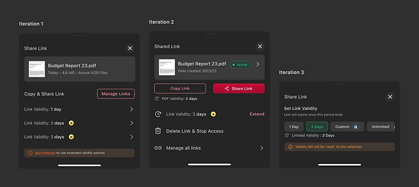.png)
Initially, the client wanted to provide the user highly fine-tuned access control over individual sharing links, catering to use-cases involving time sensitive and recipient-specific document access.
However, in the final iteration, in order to reduce turn around times, a a trade-off was made between product refinement and prioritizing efficiency. This involved balancing the customization for specific use cases with opting for a simpler flow.

Encouraging premium upgrades by offering them nested folder creation
Some design decisions for premium & upgrades for better user engagement
1️⃣ To Keep the all the premium & upgrade button Green in color
-
We wanted to implement a consistent visual hierarchy
-
Allow users to readily recognise premium services by keeping premium buttons and associated CTA's separate in colour.
-
By Leveraging the positive connotations of green - positivity, trust, and readiness, we wanted to encourage users to explore premium options with confidence.
2️⃣ Crown Vs Lock Icon for premium badges
-
The client wanted to emphasize the ‘restriction of certain features until upgraded’ thought.
-
Lock icon provides clarity on the limited or free version & pushes the benefits of upgrading.
-
It creates urgency & encourages users to explore locked content within the app